Search Page

Showing 11 - 20 of 21
CV-30 - Map Production and Management

Map production describes the experience of managing the many aspects and details of map creation. Often the map product is created for someone else—a client, supervisor, or instructor. Describing the intention of the map and evaluating available resources ahead of the project can help the cartographer define content requirements, stay on task, and ultimately meet deadlines. The project management life cycle involves clear communication between the cartographer and client, with resolutions to common questions best addressed at the beginning of the project. The process then iteratively cycles through phases that include research and production, followed by quality control, and concludes with file preparation and delivery.

CV-34 - Map Icon Design

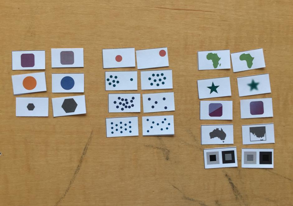
The use of map icons is an efficient way to condense a map object into a concise expression of geospatial data. Like all cartographic design, map icon design merges artistic and scientific elements into symbolic representations intended to be readily legible to map readers. This entry reviews the types of map icons and elements of icon design, including the ways in which the visual variables are used in map icon communication. As communicative devices, icons are imbued with cultural meanings and can oftentimes lead to the preservation of stereotypes. This review concludes with an examination of icons’ perpetuation of – and challenge to – cultural stereotypes.

CV-13 - User Interface and User Experience (UI/UX) Design

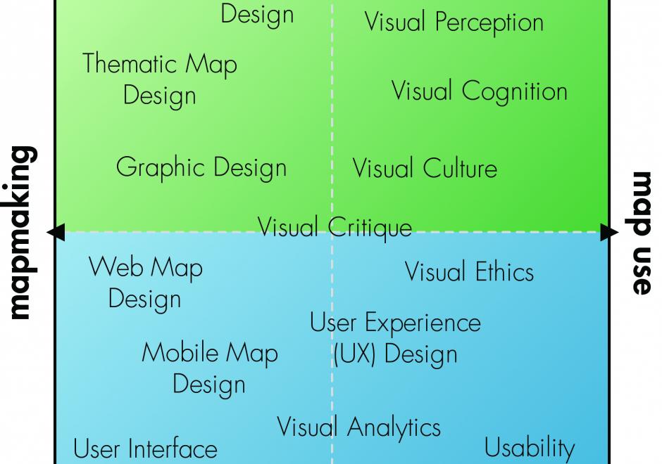
Advances in personal computing and information technologies have fundamentally transformed how maps are produced and consumed, as many maps today are highly interactive and delivered online or through mobile devices. Accordingly, we need to consider interaction as a fundamental complement to representation in cartography and visualization. UI (user interface) / UX (user experience) describes a set of concepts, guidelines, and workflows for critically thinking about the design and use of an interactive product, map or otherwise. This entry introduces core concepts from UI/UX design important to cartography and visualization, focusing on issues related to visual design. First, a fundamental distinction is made between the use of an interface as a tool and the broader experience of an interaction, a distinction that separates UI design and UX design. Norman’s stages of interaction framework then is summarized as a guiding model for understanding the user experience with interactive maps, noting how different UX design solutions can be applied to breakdowns at different stages of the interaction. Finally, three dimensions of UI design are described: the fundamental interaction operators that form the basic building blocks of an interface, interface styles that implement these operator primitives, and recommendations for visual design of an interface.

CV-28 - Lesson Design in Cartography Education

This entry describes six general variables of lesson design in cartography education and offers some practical advice for the development of materials for teaching cartography. First, a lesson’s scope concerns the set of ideas included in a lesson and helps identify different types of lessons based on the kinds of knowledge that they contain. Second, learning objectives concern the things that students should be able to do following a lesson and relate to different cognitive processes of learning. Third, a lesson’s scheme deals with the organizational framework for delivering content. Fourth, a lesson’s guidance concerns the amount and quality of supportive information provided. Fifth, a lesson’s sequence may involve one or more strategies for ordering content. Sixth, a lesson’s activity concerns what students do during a lesson and is often associated with different learning outcomes. These six variables help differentiate traditions for teaching cartography, elucidate some of the recurring challenges in cartography education, and offer strategies for designing lessons to foster meaningful learning outcomes.

CV-31 - Flow Maps

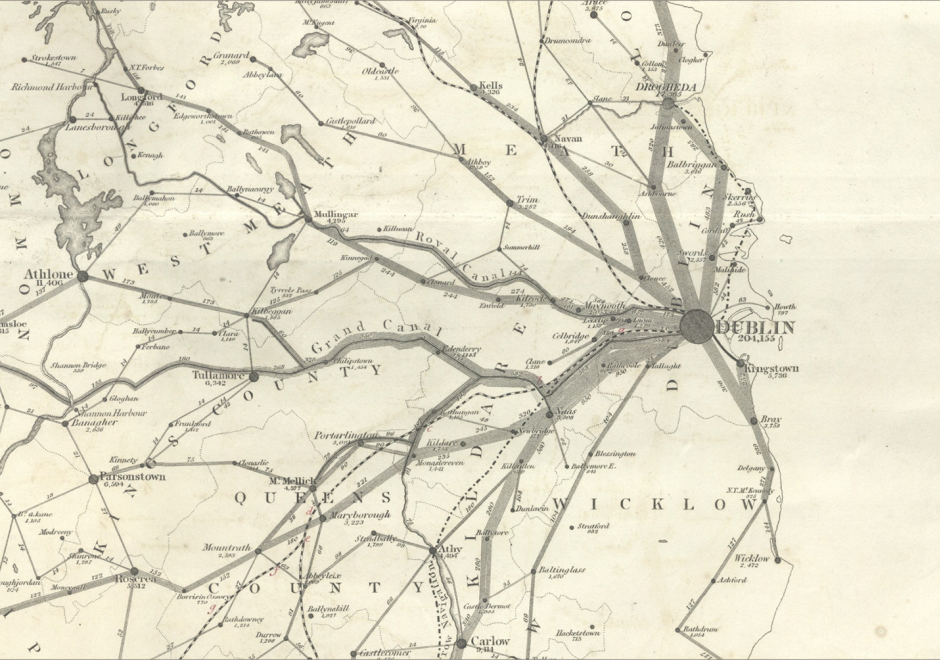
Flow mapping is a cartographic method of representing movement of phenomena. Maps of this type often depict the vector movement of entities (imports and exports, people, information) between geographic areas, but the general method also encompasses a range of graphics illustrating networks (e.g., transit and communications grids) and dynamic systems (e.g., wind and water currents). Most flow maps typically use line symbols of varying widths, lengths, shapes, colors, or speeds (in the case of animated flow maps) to show the quality, direction, and magnitude of movements. Aesthetic considerations for flow maps are numerous and their production is often done manually without significant automation. Flow maps frequently use distorted underlying geography to accommodate the placement of flow paths, which are often dramatically smoothed/abstracted into visually pleasing curves or simply straight lines. In the extreme, such maps lack a geographic coordinate space and are more diagrammatic, as in Sankey diagrams, alluvial diagrams, slope graphs, and circle migration plots. Whatever their form, good flow maps should effectively visualize the relative magnitude and direction of movement or potential movement between a one or more origins and destinations.

CV-19 - Big Data Visualization

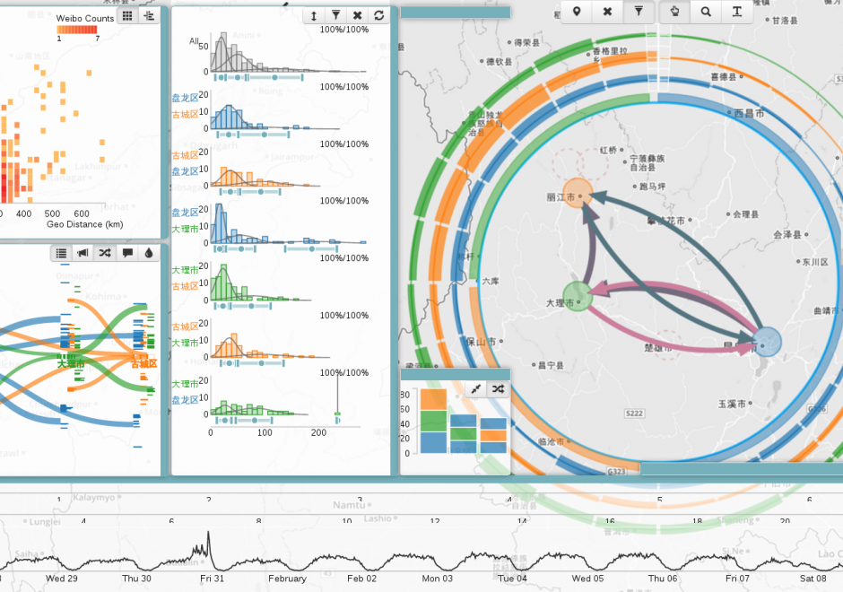
As new information and communication technologies have altered so many aspects of our daily lives over the past decades, they have simultaneously stimulated a shift in the types of data that we collect, produce, and analyze. Together, this changing data landscape is often referred to as "big data." Big data is distinguished from "small data" not only by its high volume but also by the velocity, variety, exhaustivity, resolution, relationality, and flexibility of the datasets. This entry discusses the visualization of big spatial datasets. As many such datasets contain geographic attributes or are situated and produced within geographic space, cartography takes on a pivotal role in big data visualization. Visualization of big data is frequently and effectively used to communicate and present information, but it is in making sense of big data – generating new insights and knowledge – that visualization is becoming an indispensable tool, making cartography vital to understanding geographic big data. Although visualization of big data presents several challenges, human experts can use visualization in general, and cartography in particular, aided by interfaces and software designed for this purpose, to effectively explore and analyze big data.

CV-11 - Common Thematic Map Types

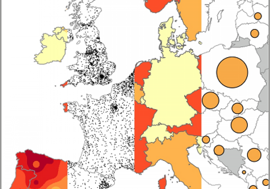
Thematic maps cover a wide variety of mapping solutions, and include choropleth, proportional symbol, isoline, dot density, dasymetric, and flow maps as well as cartograms, among others. Each thematic map type requires a different data processing method and employs different visual variables, resulting in representations that are either continuous or discrete and smooth or abrupt. As a result, each solution highlights different aspects of the mapped phenomena and shapes the message for the map readers differently. Thematic maps are tools for understanding spatial patterns, and the choice of thematic map type should support this understanding. Therefore, the main consideration when selecting a thematic map type is the purpose of the map and the nature of the underlying spatial patterns.

This entry reviews the common types of thematic maps, describes the visual variables that are applied in them, and provides design considerations for each thematic map type, including their legends. It also provides an overview of the relative strengths and limitations of each thematic map type.

CV-10 - Typography

The selection of appropriate type on maps, far from an arbitrary design decision, is an integral part of establishing the content and tone of the map. Typefaces have personalities, which contribute to the rhetorical message of the map. It is important to understand how to assess typefaces for their personalities, but also to understand which typefaces may be more or less legible in a labeling context. Beyond the choice of typeface, effective map labels will have a visual hierarchy and allow the user to easily associate labels to their features and feature types. The cartographer must understand and modify typographic visual variables to support both the hierarchy and label-feature associations.

CV-17 - Spatiotemporal Representation

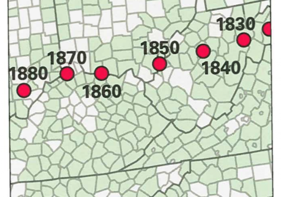
Space and time are integral components of geographic information. There are many ways in which to conceptualize space and time in the geographic realm that stem from time geography research in the 1960s. Cartographers and geovisualization experts alike have grappled with how to represent spatiotemporal data visually. Four broad types of mapping techniques allow for a variety of representations of spatiotemporal data: (1) single static maps, (2) multiple static maps, (3) single dynamic maps, and (4) multiple dynamic maps. The advantages and limitations of these static and dynamic methods are discussed in this entry. For cartographers, identifying the audience and purpose, medium, available data, and available time to design the map are vital aspects to deciding between the different spatiotemporal mapping techniques. However, each of these different mapping techniques offers its own advantages and disadvantages to the cartographer and the map reader. This entry focuses on the mapping of time and spatiotemporal data, the types of time, current methods of mapping, and the advantages and limitations of representing spatiotemporal data.

CV-01 - Cartography and Science

"Science" is used both to describe a general, systematic approach to understanding the world and to refer to that approach as it is applied to a specific phenomenon of interest, for example, "geographic information science." The scientific method is used to develop theories that explain phenomena and processes. It consists of an iterative cycle of several steps: proposing a hypothesis, devising a way to make empirical observations that test that hypothesis, and finally, refining the hypothesis based on the empirical observations. "Scientific cartography" became a dominant mode of cartographic research and inquiry after World War II, when there was increased focus on the efficacy of particular design decisions and how particular maps were understood by end users. This entry begins with a brief history of the development of scientific cartographic approaches, including how they are deployed in map design research today. Next it discusses how maps have been used by scientists to support scientific thinking. Finally, it concludes with a discussion of how maps are used to communicate the results of scientific thinking.

Pages